Week 13 (1st - 5th Feb)
- Mar 18, 2021
- 5 min read
Monday 1st February

Another one. I didn't really do anything new, I just did it again. There were slightly different objects around me, hence different objects on the page. Normally, I'm under the impression that I make a work once, then if I want to do it again, I do it differently; I try to develop it further. I was stuck though, and I liked it the way it was, so I created another "my vicinity" drawing in the exact same way. I've been encouraged throughout my course to keep developing my work, but this time, I didn't know how. I like it as-is and think that maybe through the repeated actions involved in making these drawings, a new idea for development may be birthed, but I shouldn't be hard on myself, pressure myself or try to force it.
That said, I would like to draw this on a larger sheet of paper (so that all of the items fit completely) but I'm out of paper larger than this size.
Tuesday 2nd February

Returned to 'Out The Miry Clay'
Surprised by how quickly I've worked through the middle and bottom ninth of this painting. It had taken me months to get to the stage I was before today. The experiments I had been doing thus far, though completely unrelated, have really been helping my approach to this painting: I'm less focused on precision and more on essence. I'm now using tones to replicate the shapes I see, rather than copying every detail, which I actually find incredibly tiring. The fact that I'd found the painting tiring was the reason why it had taken me so long to complete the paining in the first place. I wanted realism but was using a very safe but laborious approach - one that I'd stopped enjoying. Through experiments in unrelated projects, I'm fortunate to be able to say that I've started to transfer this spirit of experimentation and "just making" onto this planned painting. I'm fortunate to say I've started enjoying this painting again, and am no longer focused on perfection or performance, but simply enjoying myself.
Wednesday 3rd February

I've been working on this cloud portrait for a while, and I'm still not sure if it's finished. I planned to produce a soft, monochrome cloud painting and had had the image of it in my head before I first started working on it. In the first layer, I found that the shapes of the clouds were all the same, and didn't appear very natural. To remedy this, I firstly took a break from the work. When I'm in my room at my desk, or in the kitchen cooking or by the sink, I'm frequently looking at the clouds. I do it without thought in mind, I just like the way they look. i feel calmer when I'm looking at them, and find them beautiful to look at.
After the first attempt at these clouds, things changed a bit. I would look at the clouds more analytically, trying to observe details that I could then apply to my work. I was trying to make mental notes of the shapes and textures, particularly at the edges of the clouds. I'd tried to take photos of the clouds before, but wasn't happy with how the colours had been captured, nor was I happy with the angle that my camera was capturing it from. The pure image was better for me, not the photographed image. The pure image and the painted image, I might add.
In a similar vein, I don't fully like how the camera renders the painted image either - to me, this painting looks much better in person, much more delicate.
To go back a bit, I found that connecting some of the clouds and overlapping some of them with new clouds helped me to take the work from a repeating pattern to a more realistic cloudscape. It was a relief that I'm thankful to have discovered, because I really didn't know how else to paint clouds.
Thursday 4th February


I wanted to do something different with the 'my vicinity' drawings, so I started playing around with highlighters. I would try one technique, then move onto another, then another until either I had run out of ideas or needed a break from working. Again, this was spontaneous, intended to something new. I'm happy with them and the fact that I experimented.
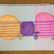
I think the first one (with coloured silhouettes) for the vibrancy, but I don't find it striking. The various colours make my eyes dart across the page, making it slightly challenging to settle and focus on anything in particular. The second one (with coloured overlaps) is very busy and I enjoy looking at this a lot, because I feel like there is a lot to see and identify. Each shape has been coloured in and they are all layered above one another, which makes me want to look at it for a long time. I would consider rendering the drawings in this way again, this time either using acrylics or watercolours instead of highlighters. The third one (with dots on the intersections) reminds me of a tube map, and I enjoyed pointing out the intersections more than I liked looking at them, once I'd marked them with the dots. I think it would be good for me to further consider how to identify a particular feature I like, without making it too obvious or changing the aesthetic of the work. I say this because I like it less with the dots on. Perhaps I just liked searching for the intersections, identifying and moving on. By marking them with bold dots, I've made them very prominent, such that it's not necessary to search for them. Maybe I saw the searching as a game or puzzle, and now that I've marked the intersections all out, what I've got now is a completed puzzle, which isn't that fun to look at.
For the final one, following on from the previous drawing, I was trying to colour in the non-overlapping segments, such that they were overlapping. This was the first time I had tried to overlap in this way, artificially and I prefer this to the previous drawing. It wasn't an approach I gave a second thought to, but my sole aim was to colour and mark each new area in a way that hadn't been done before. With this in mind, I'd be curious to repeat this style of colouring with more items on the page, and maybe also in monochrome, to make it like a game, where you'd have to figure out the origins of the particular lines.
The remaining five paintings came from the same aim, which was to paint the blue-pink sky at sunset. I would say I got carried away with colours and textures, deviating from this initial objective. I think that reveals the hierarchy of painting elements that may drive me the most: I think texture may be first, followed by colours and then maybe realism, or with the latter two reversed. This would explain the interest in monochrome...
Friday 5th February
-
Comments